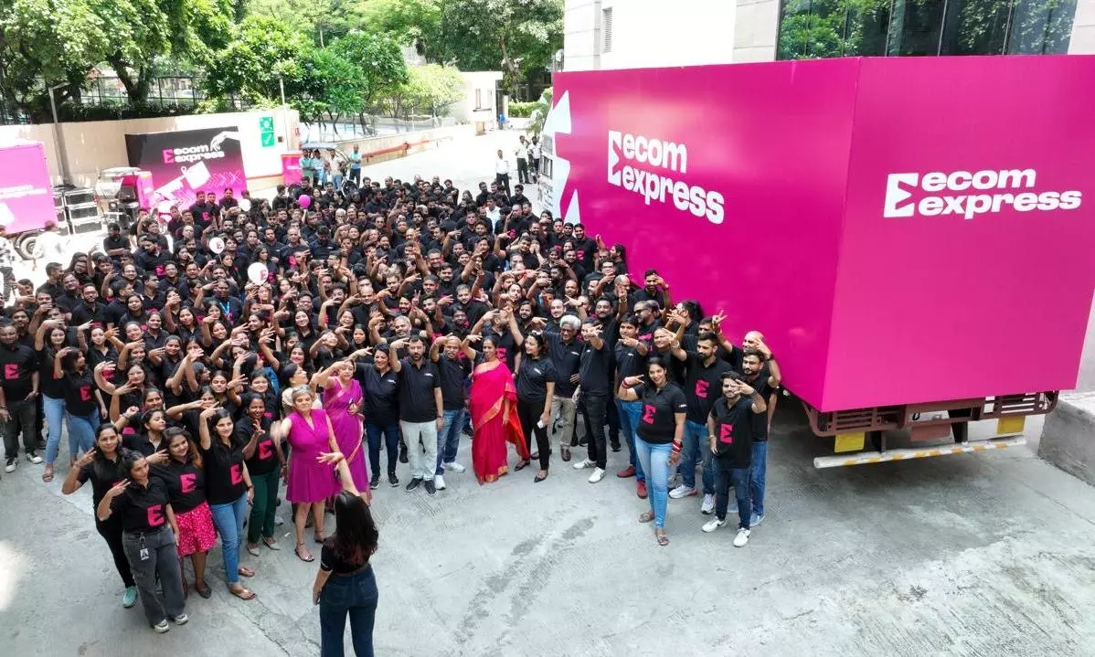
Ecom Express rebrands with a vibrant magenta identity, emphasising customer focus and innovation.

Ecom Express has introduced a striking new brand identity, adopting a bold magenta color as part of its rebranding initiative. This transformation highlights the company’s dedication to being customer-centric, with a renewed focus on addressing specific customer needs, improving customer-facing metrics, and seamlessly integrating innovative technology across its extensive pan-India express logistics network.
The new visual identity, featuring a dynamic logo with a forward-moving arrow within a square, symbolises Ecom Express’s commitment to delivering excellence. The logo ingeniously incorporates the letter “E,” representing Expression, Innovation, and Progress, while the magenta color embodies bravery, self-expression, and strength.
Ajay Chitkara, CEO and MD of Ecom Express, emphasised the significance of this rebranding, stating, “Our refreshed brand identity reaffirms our customer-first approach as we continue to advance in the logistics sector. We are committed to leveraging technology and innovation to provide reliable, high-speed services with the widest network reach.”
The new identity also underscores the company’s commitment to its employees and delivery partners, reinforcing its core values of excellence and inclusivity.


